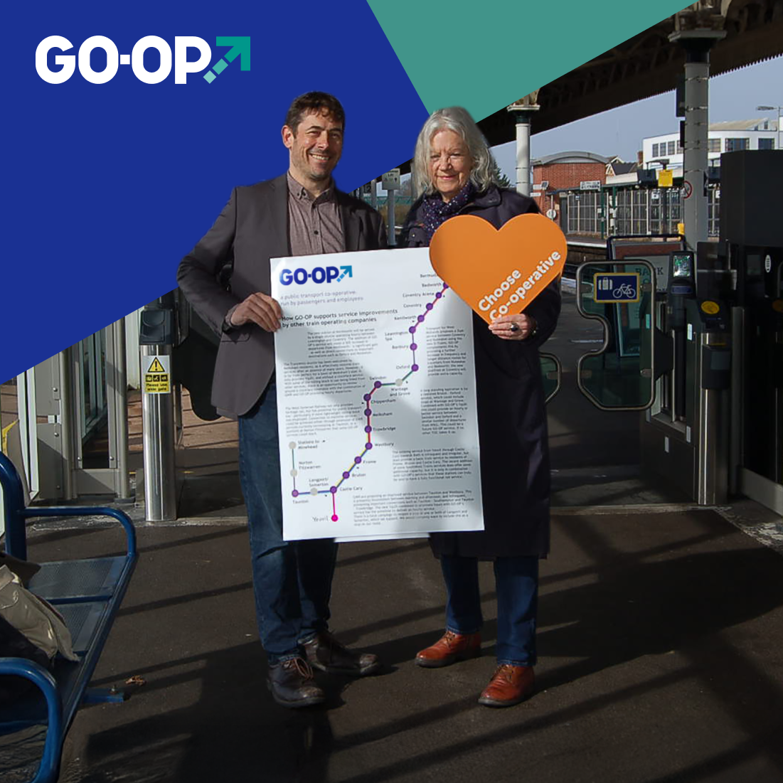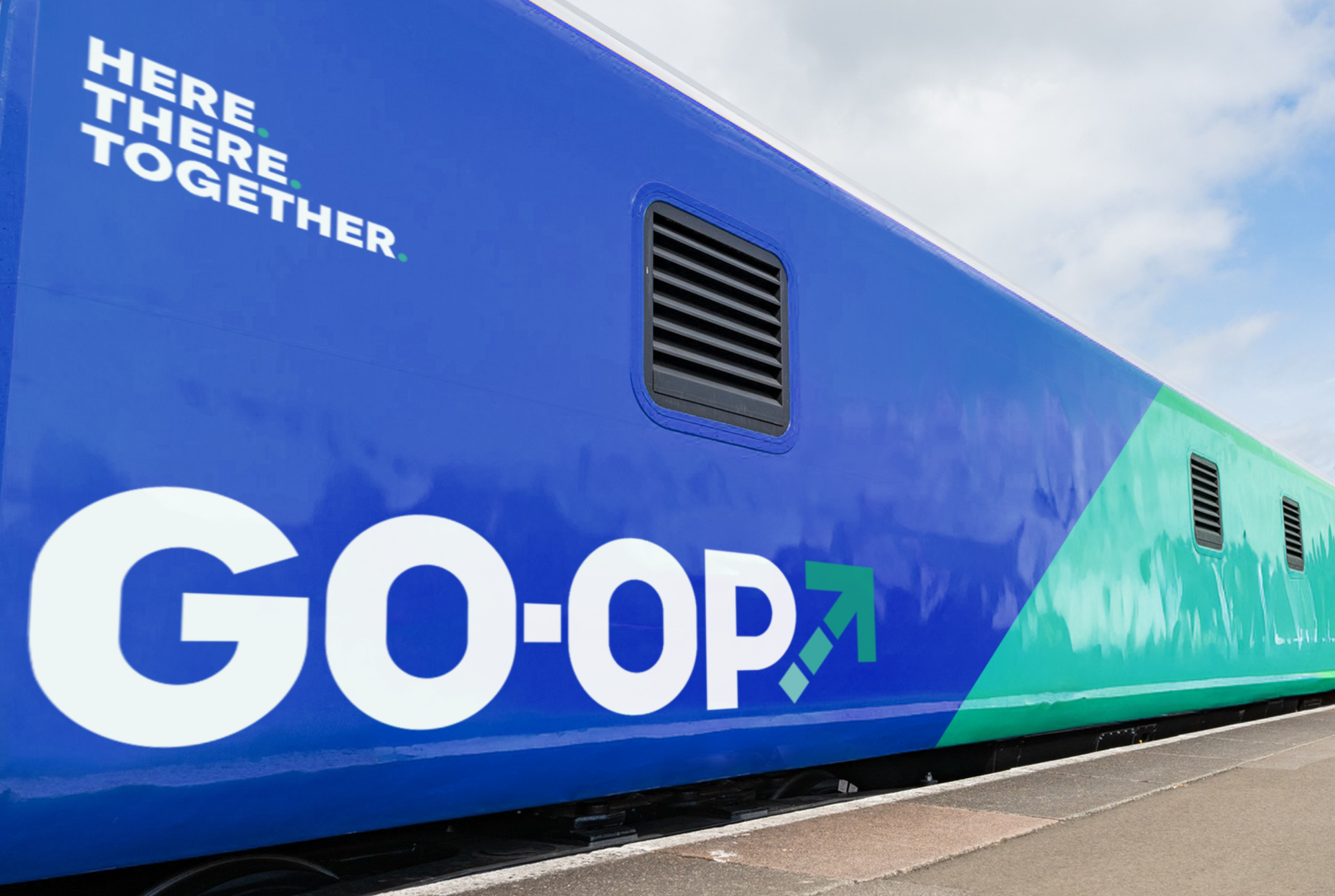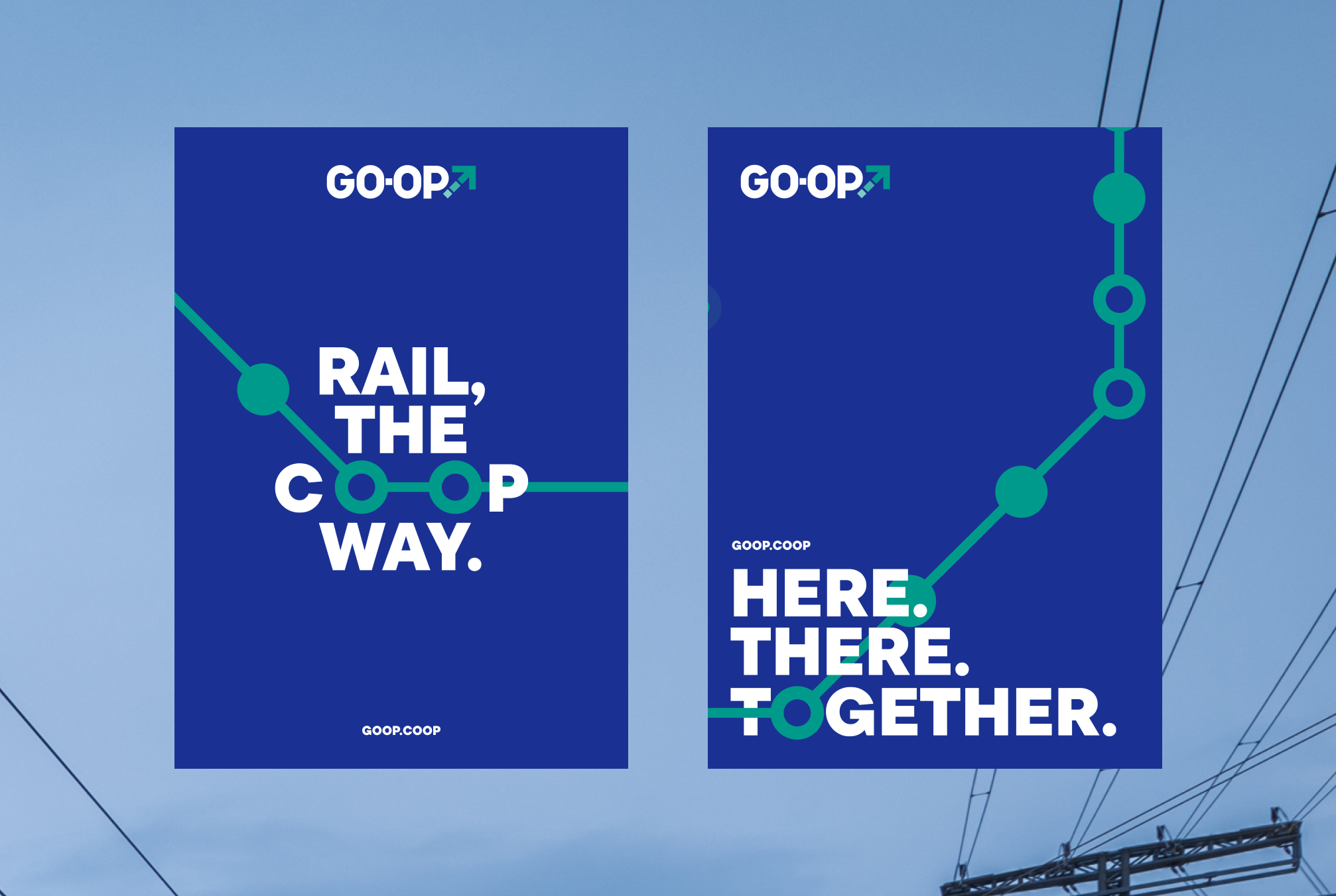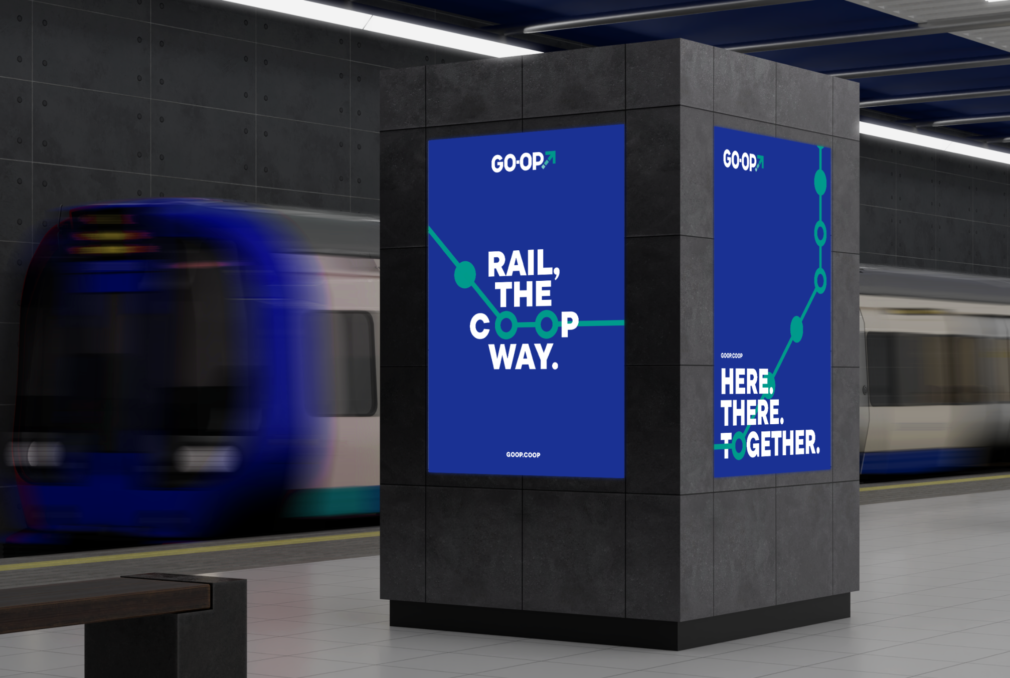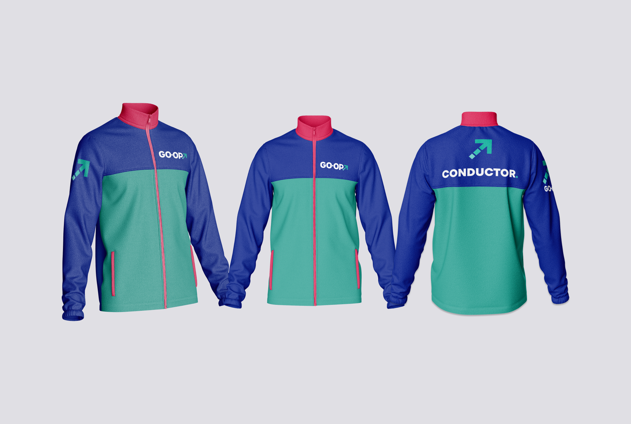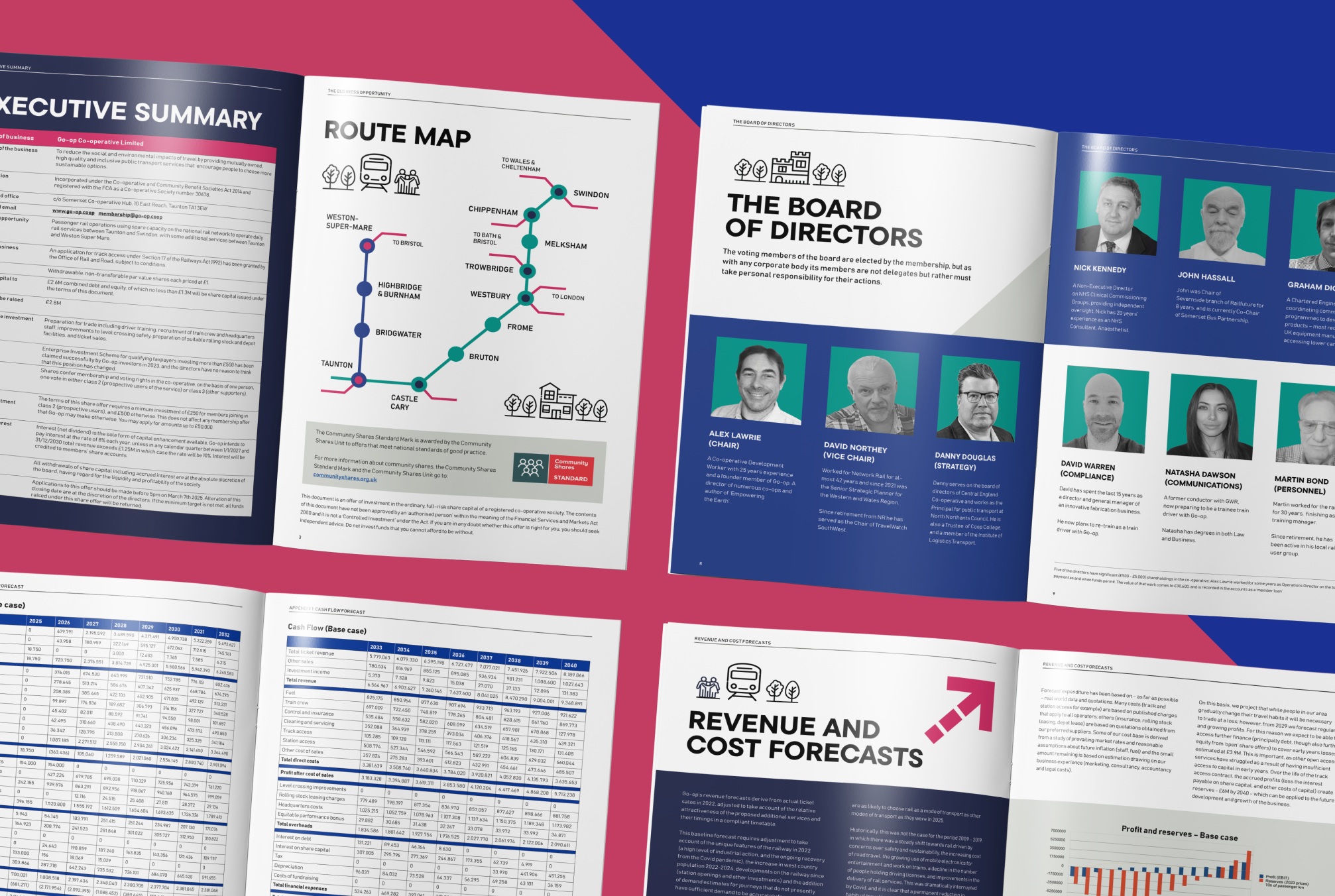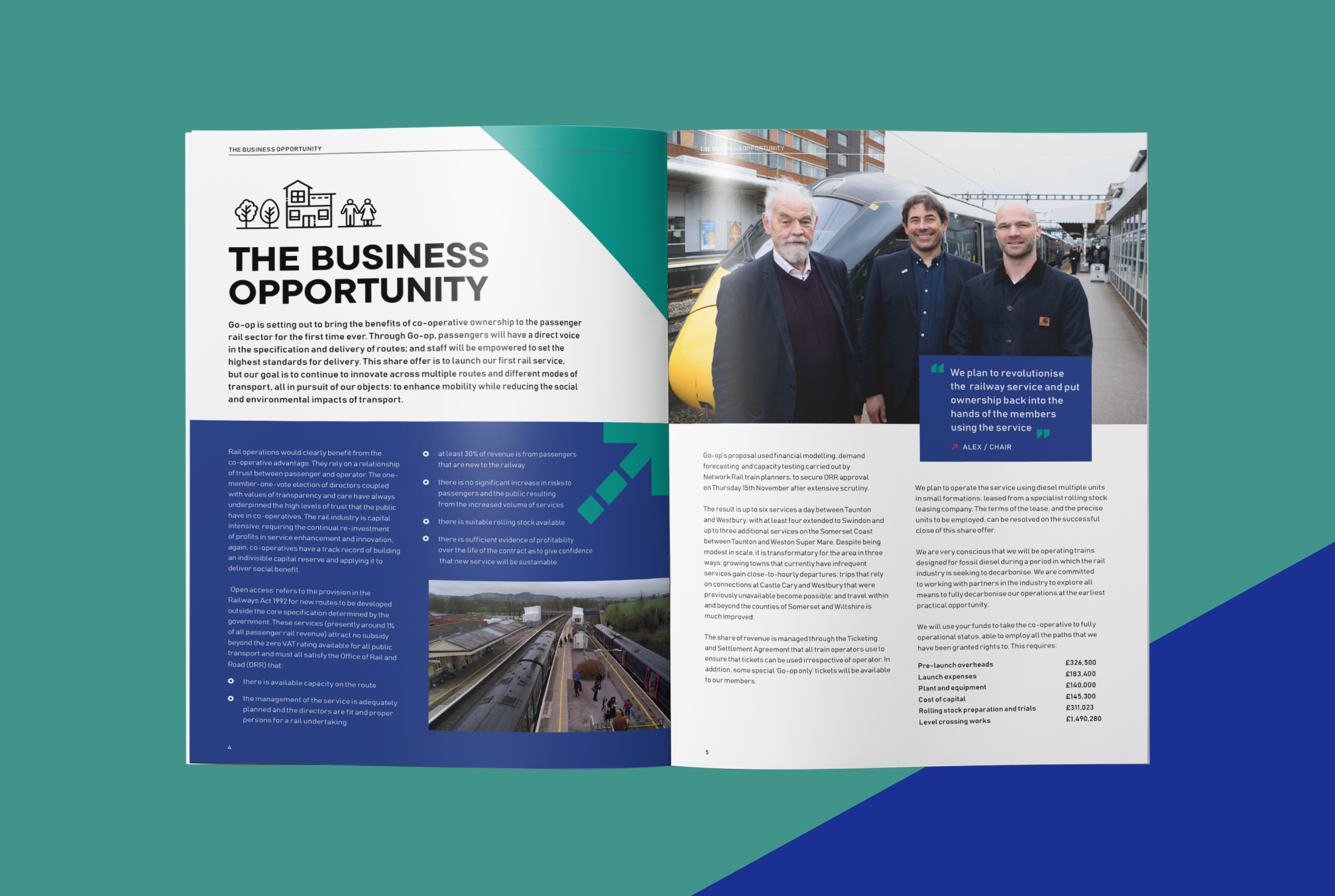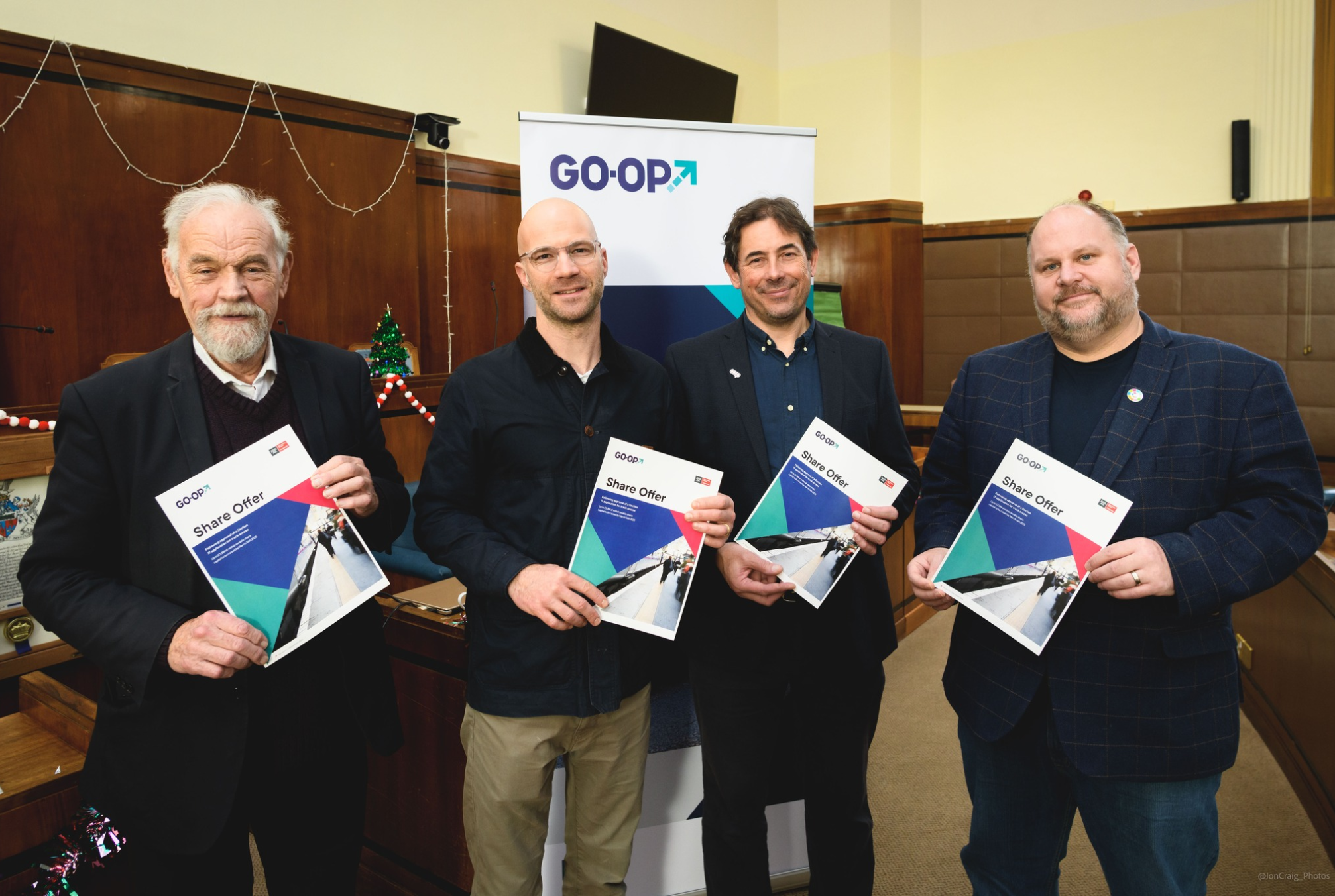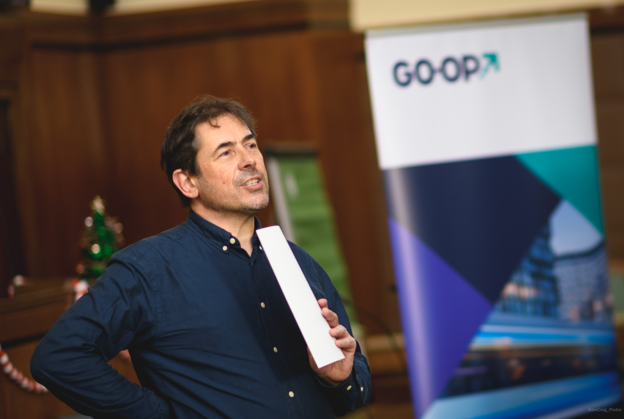
We were delighted to partner with a fellow co-op. We shaped a confident, people-first identity with a clean wordmark, accessible colour palette, clear typography and graphic elements inspired by routes and connections. We applied it across web assets, social templates, pitch decks, factsheets and event materials, and produced a simple funding campaign with key visuals and copy. The result is a consistent, easy to use brand that tells GO-OP’s story and helps win support.